How should I brew the new Huila beans?
Components that wear your brand.
113 React components for apps, AI agents and story pages. Each one reads its colours, typeface and corners from a brand contract.
Read the install steps
npm i @brand-studio/uiLive components in your choice of brand
A pour-over brings out the red fruit. Want the recipe?
Yes, for one cup.
For a 250 ml cup, use 15 g of coffee ground like coarse sand, and water around 94°C.
Place a reorder?
The agent wants to buy your usual coffee.
orders.create({ item: "ethiopia-guji-250", quantity: 2 })Launch email
1 of 5- Read the brief, Done
- Collect product photos, In progress
- Draft the launch email, Not started
- Check links, Not started
- Schedule the send, Not started
Ethiopia Guji
Washed, light roast. Peach, jasmine and black tea.
250 gWhole bean
Comparing roast notes
- orders.search14 results, done
- catalog.list, running
- stock.checktimed out, failed
One email on Monday with new roasts.
Not available in your region yet.
Every card is the real package. Still, Hollis and Deskhand are fictional brands.
Take a phone apart.
This exploded view goes four levels deep: the logic board opens to the processor, and the processor to its silicon. Pick a layer, then a part, to zoom in.
Its colours and type come from the brand picked in the header.
Turn a 3x3 cube in 3D, take it apart and solve it in seven stages
Fig. 1PhoneHow a phone is built
- 2Front camera hole
- 1Power button2USB-C port
- 5Speaker
- 2Camera window
Create your brand assets.
The brand-design skill takes the same brand contract into character design, sticker-style artwork and icon exports.
Explore asset creation- Mascots
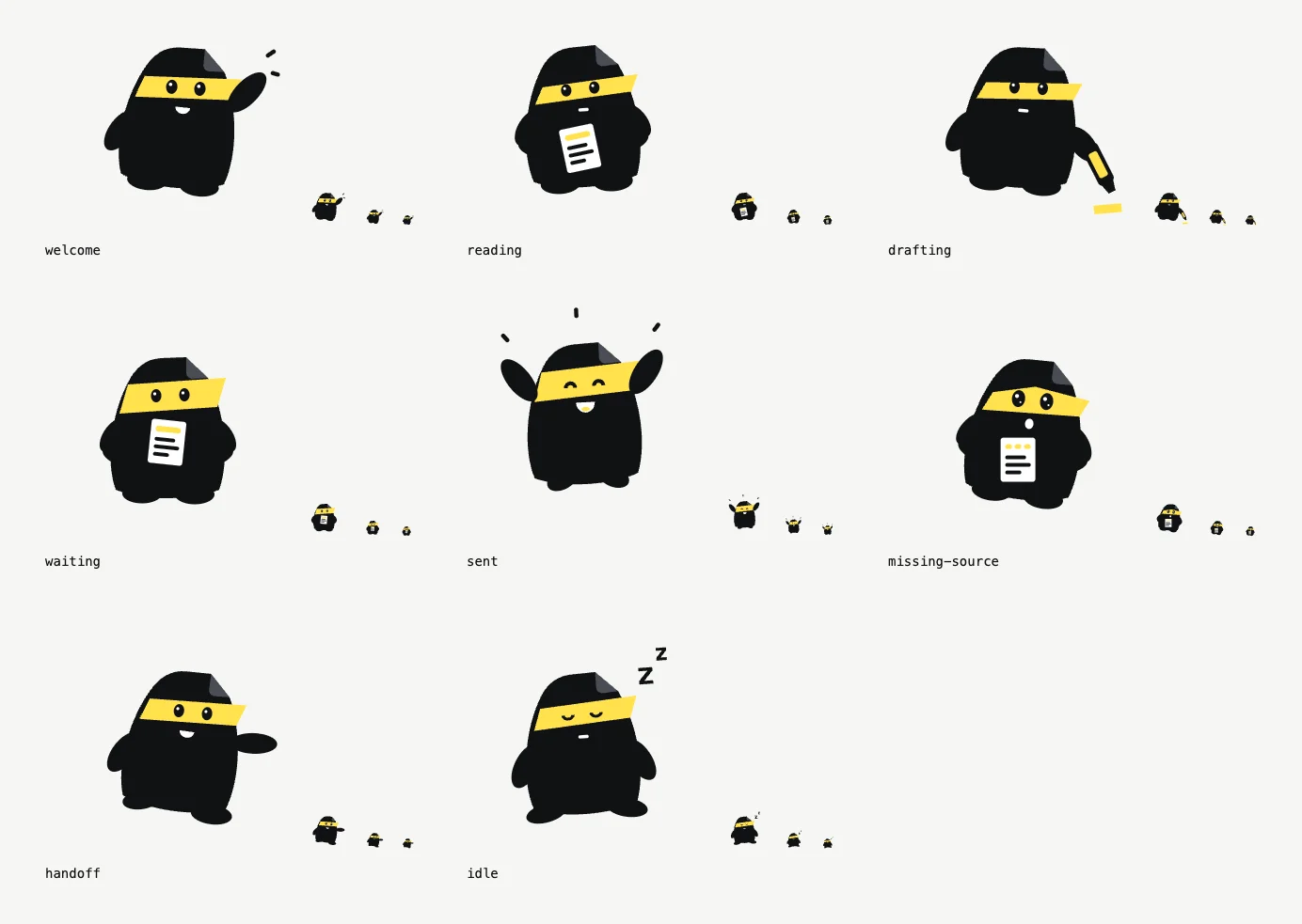
- Define a character, build expression states and review SVG, PNG or optional 3D renders.
- Sticker-style artwork
- Use the mascot workflow to make outlined character artwork with a consistent silhouette and palette.
- Icons and app icons
- Check UI glyphs and export sprites, favicons and app icons for web, iOS and Android.
Questions about the package
- What is in @brand-studio/ui?
- 113 React components in 9 groups: Foundations, App, Navigation, Data, AI agents, Social, Effects, Storytelling, Product page. They cover app screens, AI agent interfaces, effects and story pages.
- How does a component take on my brand?
- Wrap the app in BrandTheme and pass a palette with light and dark tokens: surface, elevated, ink, muted, accent, onAccent, line, font and radius. BrandTheme sets them as CSS variables, and every component inside it reads them.
- Which React versions does it support?
- React 18.3 or newer, or React 19. React and React DOM are peer dependencies, and Base UI is the one runtime dependency.
- Do I need Tailwind CSS?
- No. The package ships one plain CSS file, @brand-studio/ui/styles.css, which you import once.
- Where does the brand contract come from?
- The brand-design skill writes it to brand/brand.json from your business facts, audience and category research. Install the skill with npx skills add hungduong-projects/brand-studio --skill brand-design, or write the palette by hand.
- Can a coding agent read these docs?
- Yes. Each docs page has a Markdown copy, /llms.txt lists them, and /llms-full.txt holds every page in one file.
- What is the licence?
- MIT. The source is on GitHub at hungduong-projects/brand-studio.