

import { ActionLink, CardCarousel } from '@brand-studio/ui';
import { camera } from '@/demos/assets';

const picture = (name: string, alt: string) => {
  const image = camera(name, alt);
  return <img src={image.src} alt={image.alt} width={800} height={800} />;
};

export default function CardCarouselDemo() {
  return (
    <CardCarousel
      title="Keep it running."
      action={<ActionLink href="#service" tone="secondary" shape="pill">All guides</ActionLink>}
      cards={[
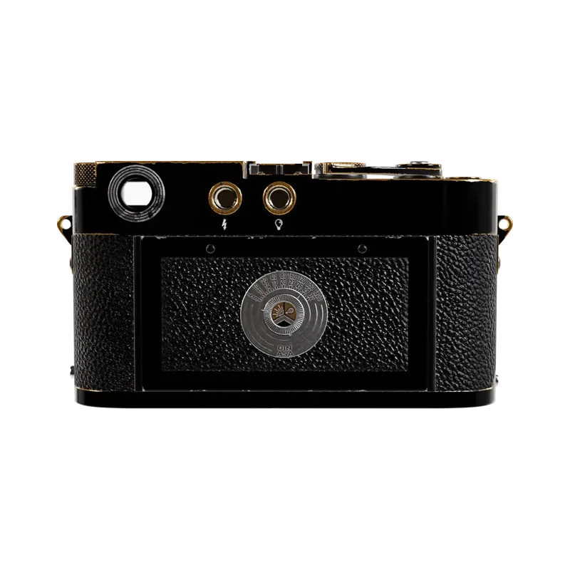
        { eyebrow: 'Guide', title: 'Loading film without looking.', body: 'Three steps you learn once.', media: picture('back-square', 'The back of the camera.'), href: '#film' },
        { eyebrow: 'Guide', title: 'Sunny 16 in one page.', body: 'Set exposure with no meter.', media: picture('top-square', 'The shutter dial on the top plate.'), href: '#sunny' },
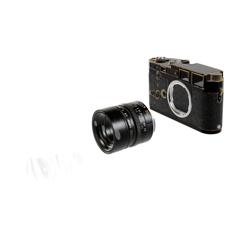
        { eyebrow: 'Service', title: 'Every part has a price.', body: 'Order a single screw or a new shutter.', media: picture('apart-square', 'The camera taken apart.'), href: '#parts' },
        { eyebrow: 'Service', title: 'Clean, lube, adjust.', body: 'Send it in every ten years.', media: picture('side-square', 'The camera from the side.'), href: '#service' },
      ]}
    />
  );
}Installation
pnpm add @brand-studio/uinpm install @brand-studio/uiyarn add @brand-studio/uibun add @brand-studio/uiInstall the peer dependencies
npm install react react-domImport the stylesheet once
import '@brand-studio/ui/styles.css';Wrap your app in a brand theme
import { BrandTheme, CardCarousel } from '@brand-studio/ui';
import brand from './brand.json';

<BrandTheme palette={brand.tokens} mode="system">
  {/* your app */}
</BrandTheme>
Usage
import { CardCarousel } from '@brand-studio/ui';<CardCarousel
title="Keep it running."
cards={[{ eyebrow: 'Guide', title: 'Loading film without looking.', body: 'Three steps you learn once.', href: '/guides/film' }]}
/>Give each card a picture in media at the bottom, or leave it text only. A card with href becomes one link.
Accessibility
- The row is a list labelled by the title. Touch and trackpad users can swipe it; the buttons move one screen of cards.
- The previous and next buttons are disabled at the ends of the row.
API Reference
| Prop | Type | Default |
|---|---|---|
title? | React.ReactNode | – |
cards | CarouselCard[] | – |
action? | React.ReactNode | – |
label? | string | – |
className? | string | – |