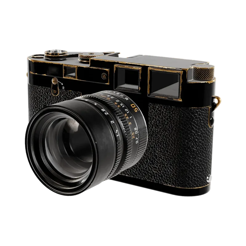
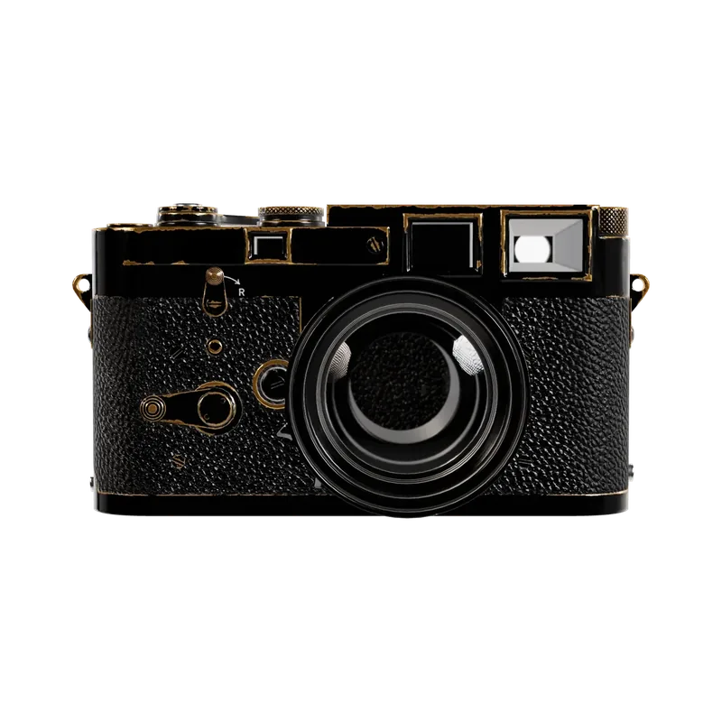
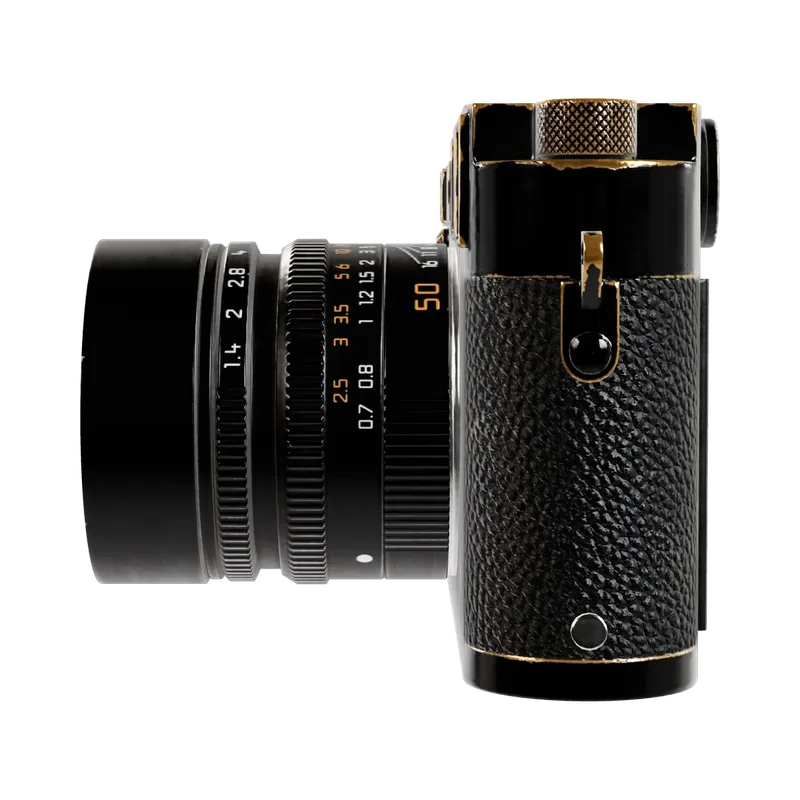
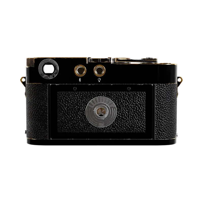

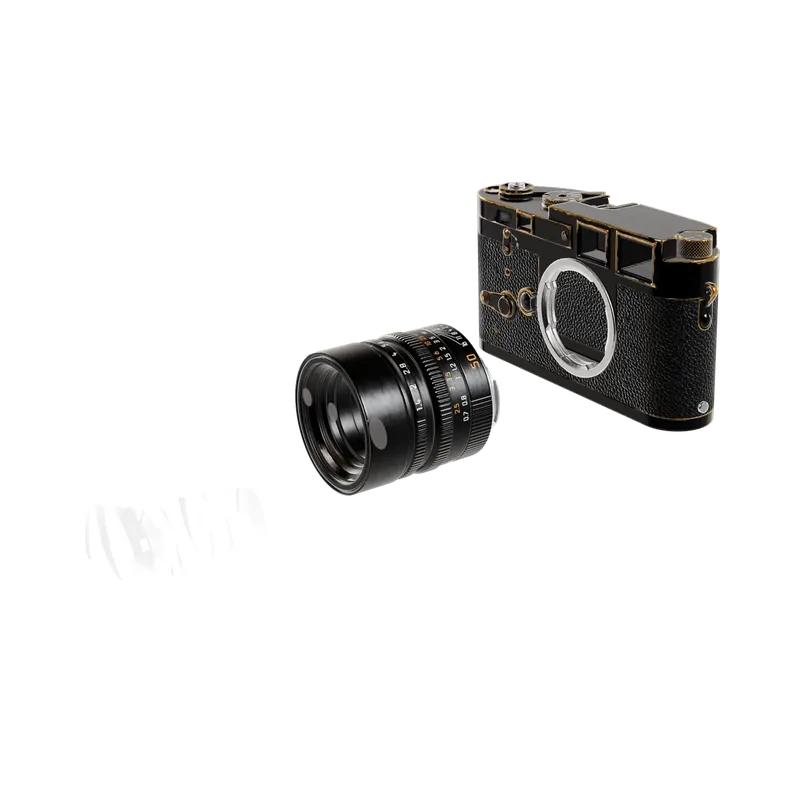
1 / 8
import { RingGallery } from '@brand-studio/ui';
import { cameraViews } from '@/demos/assets';

export default function RingGalleryDemo() {
  return (
    <div style={{ width: '100%' }}>
      <RingGallery label="Halden R, every angle" images={[...cameraViews, ...cameraViews.slice(0, 2)]} />
    </div>
  );
}Installation
pnpm add @brand-studio/uinpm install @brand-studio/uiyarn add @brand-studio/uibun add @brand-studio/uiInstall the peer dependencies
npm install react react-domImport the stylesheet once
import '@brand-studio/ui/styles.css';Wrap your app in a brand theme
import { BrandTheme, RingGallery } from '@brand-studio/ui';
import brand from './brand.json';

<BrandTheme palette={brand.tokens} mode="system">
  {/* your app */}
</BrandTheme>
Usage
import { RingGallery } from '@brand-studio/ui';<RingGallery label="Every angle" images={images} />Accessibility
- The ring is a labelled carousel; only the image facing you is exposed to screen readers.
- Previous and next buttons and arrow keys turn it one image at a time, and the counter is announced.
- Dragging spins sideways only, so the page still scrolls on touch.
- With reduced motion it turns without gliding.
API Reference
| Prop | Type | Default |
|---|---|---|
images | ImageAsset[] | – |
label? | string | 'Gallery' |
className? | string | '' |