A row of large slides that plays by itself while on screen, with a progress pill and a pause button.
Get the highlights.
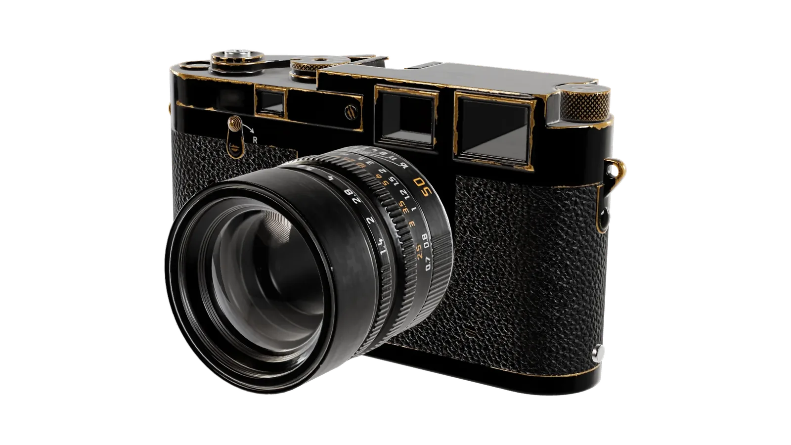
Worn to brass. The paint gives way where your hands go.
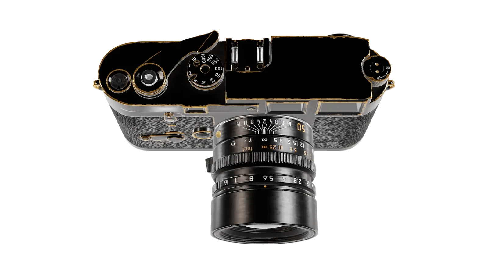
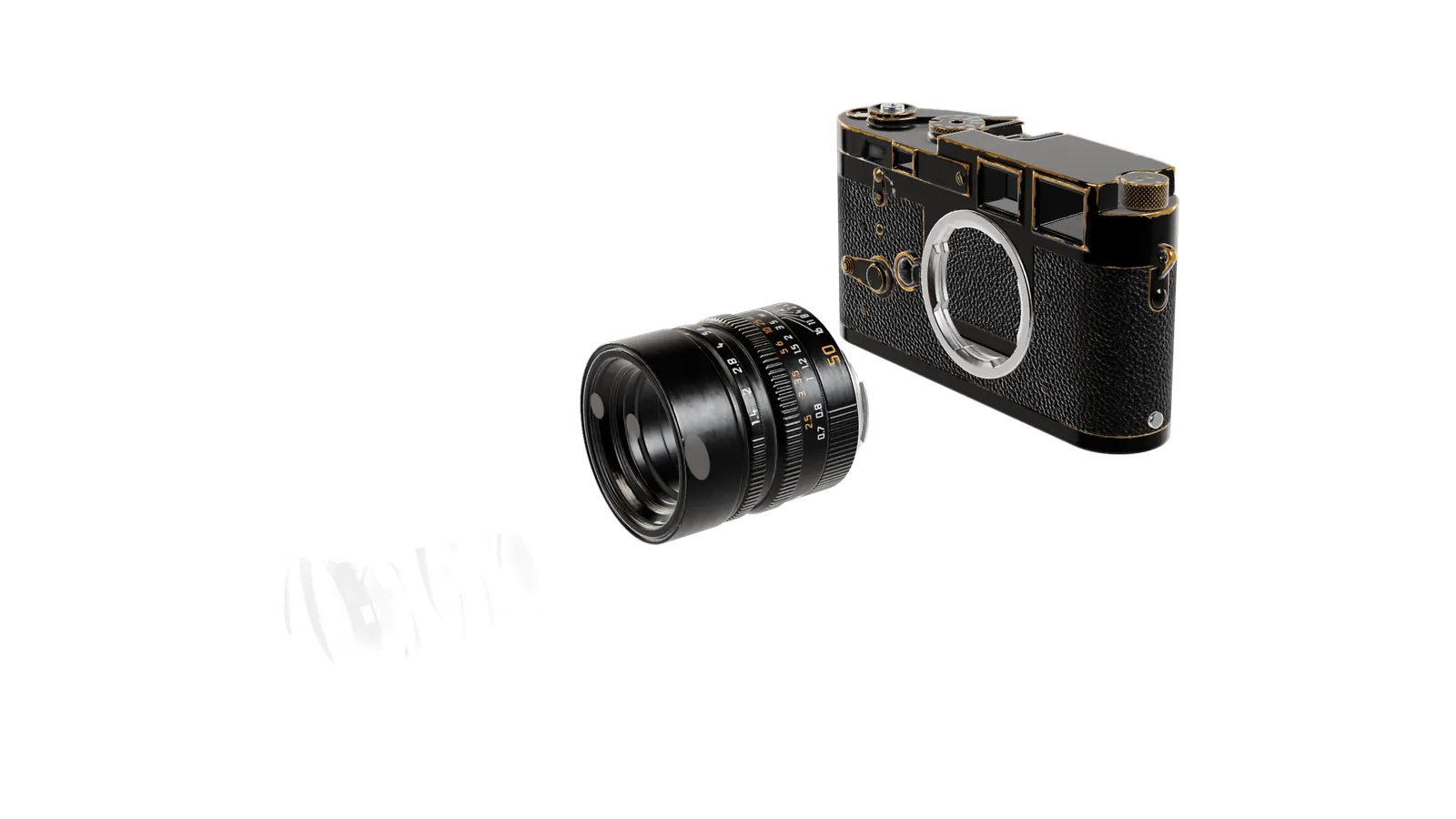
import { HighlightsGallery } from '@brand-studio/ui';
import { camera } from '@/demos/assets';

const slide = (name: string, alt: string) => {
  const image = camera(name, alt);
  return <img src={image.src} alt={image.alt} width={1600} height={900} style={{ objectFit: 'contain', padding: '18% 8% 3%', boxSizing: 'border-box' }} />;
};

export default function HighlightsGalleryDemo() {
  return (
    <HighlightsGallery
      title="Get the highlights."
      items={[
        { media: slide('three', 'The camera from the front left, black paint worn to brass.'), caption: <><strong>Worn to brass.</strong> The paint gives way where your hands go.</> },
        { media: slide('top', 'The top plate from above, with the shutter dial.'), caption: <><strong>Every control on top.</strong> Nothing hides in a menu.</> },
        { media: slide('apart', 'The camera taken apart into body, lens barrel and glass.'), caption: <><strong>Comes apart for service.</strong> The lens leaves in one turn.</> },
      ]}
    />
  );
}Installation
pnpm add @brand-studio/uinpm install @brand-studio/uiyarn add @brand-studio/uibun add @brand-studio/uiInstall the peer dependencies
npm install react react-domImport the stylesheet once
import '@brand-studio/ui/styles.css';Wrap your app in a brand theme
import { BrandTheme, HighlightsGallery } from '@brand-studio/ui';
import brand from './brand.json';

<BrandTheme palette={brand.tokens} mode="system">
  {/* your app */}
</BrandTheme>
Usage
import { HighlightsGallery } from '@brand-studio/ui';<HighlightsGallery
title="Get the highlights."
items={[{ media: <img src="/worn.webp" alt="…" />, caption: <><strong>Worn to brass.</strong> The paint gives way where your hands go.</> }]}
/>Keep captions to one short sentence: they sit over the top left of each slide, so leave that part of the picture clear. interval sets the time per slide in milliseconds.
Accessibility
- The gallery plays only while half of it is on screen, and pauses while the pointer or keyboard focus is inside it.
- It starts paused when the reader prefers reduced motion. The play button toggles it at any time.
- Each dot is a button naming its slide, and the current one has
aria-current. Slides that are not current are hidden from screen readers.
API Reference
| Prop | Type | Default |
|---|---|---|
title? | React.ReactNode | – |
items | Highlight[] | – |
interval? | number | – |
label? | string | – |
className? | string | – |