Make room for the first sip.
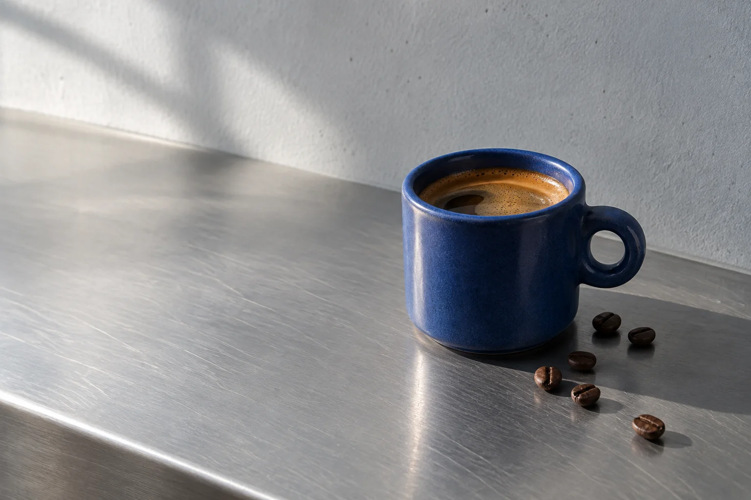
The Huila lot, poured at ninety-four degrees.
import { PinnedZoom } from '@brand-studio/ui';
import { cup } from '@/demos/assets';

export default function PinnedZoomDemo() {
  return (
    <div style={{ width: '100%' }}>
      <PinnedZoom asset={cup} title="Make room for the first sip.">
        <p style={{ margin: 0 }}>The Huila lot, poured at ninety-four degrees.</p>
      </PinnedZoom>
    </div>
  );
}Installation
pnpm add @brand-studio/uinpm install @brand-studio/uiyarn add @brand-studio/uibun add @brand-studio/uiInstall the peer dependencies
npm install react react-domImport the stylesheet once
import '@brand-studio/ui/styles.css';Wrap your app in a brand theme
import { BrandTheme, PinnedZoom } from '@brand-studio/ui';
import brand from './brand.json';

<BrandTheme palette={brand.tokens} mode="system">
  {/* your app */}
</BrandTheme>
Usage
import { PinnedZoom } from '@brand-studio/ui';<PinnedZoom asset={cup} title="Make room for the first sip.">
<p>The Huila lot, poured at ninety-four degrees.</p>
</PinnedZoom>The title fades as the picture grows; the children appear over the full picture at the end.
Accessibility
- The picture keeps its alt text, and the title is a real heading.
- Before scripts run, and under reduced motion, it is the title over a full-width image.
API Reference
| Prop | Type | Default |
|---|---|---|
asset | ImageAsset | – |
title? | React.ReactNode | – |
children? | React.ReactNode | – |
className? | string | '' |