import { BeforeAfter } from '@brand-studio/ui';
import { pour, pourFlat } from '@/demos/assets';

export default function BeforeAfterDemo() {
  return (
    <figure style={{ width: '100%', maxWidth: 720, margin: 0 }}>
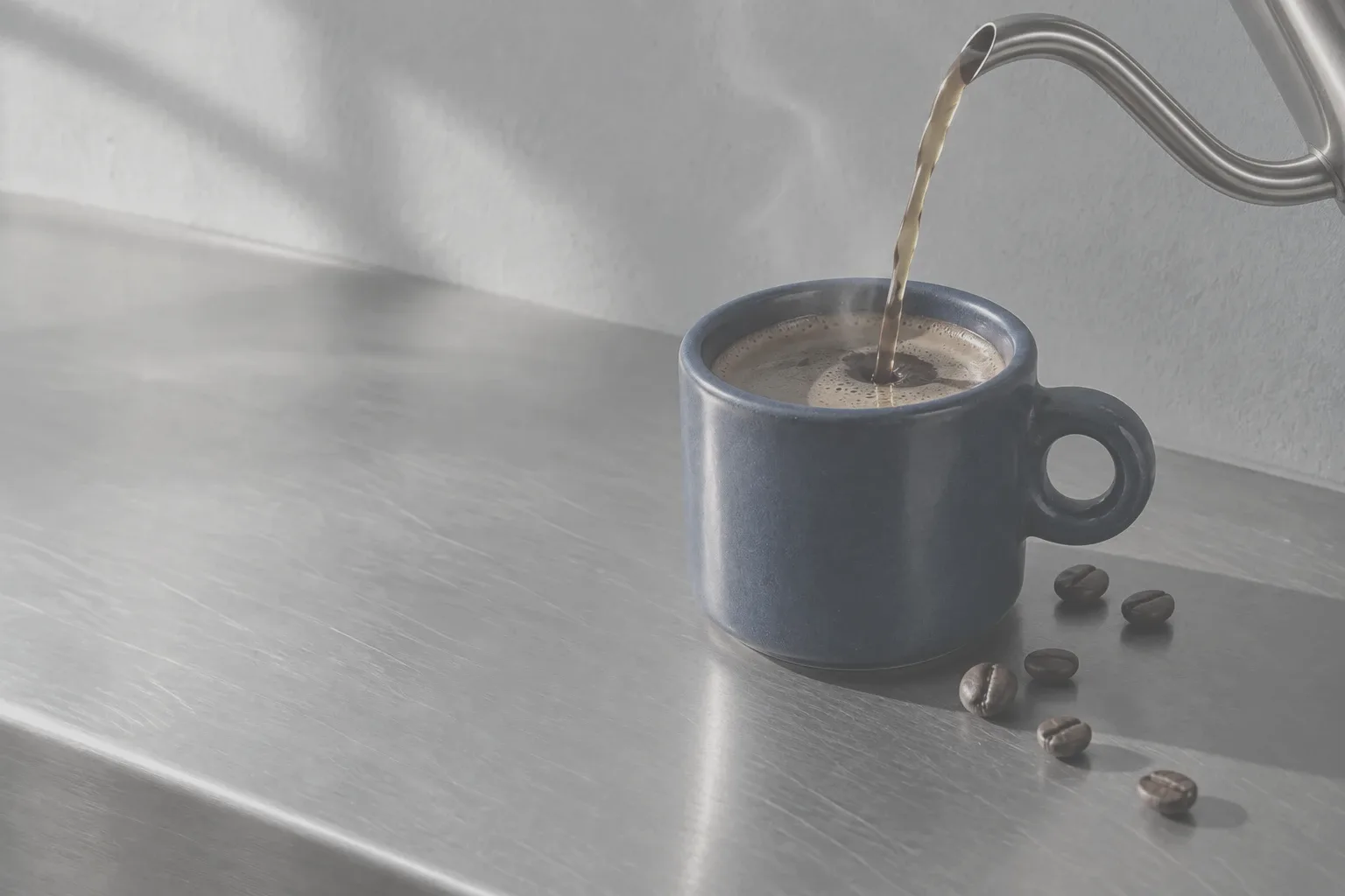
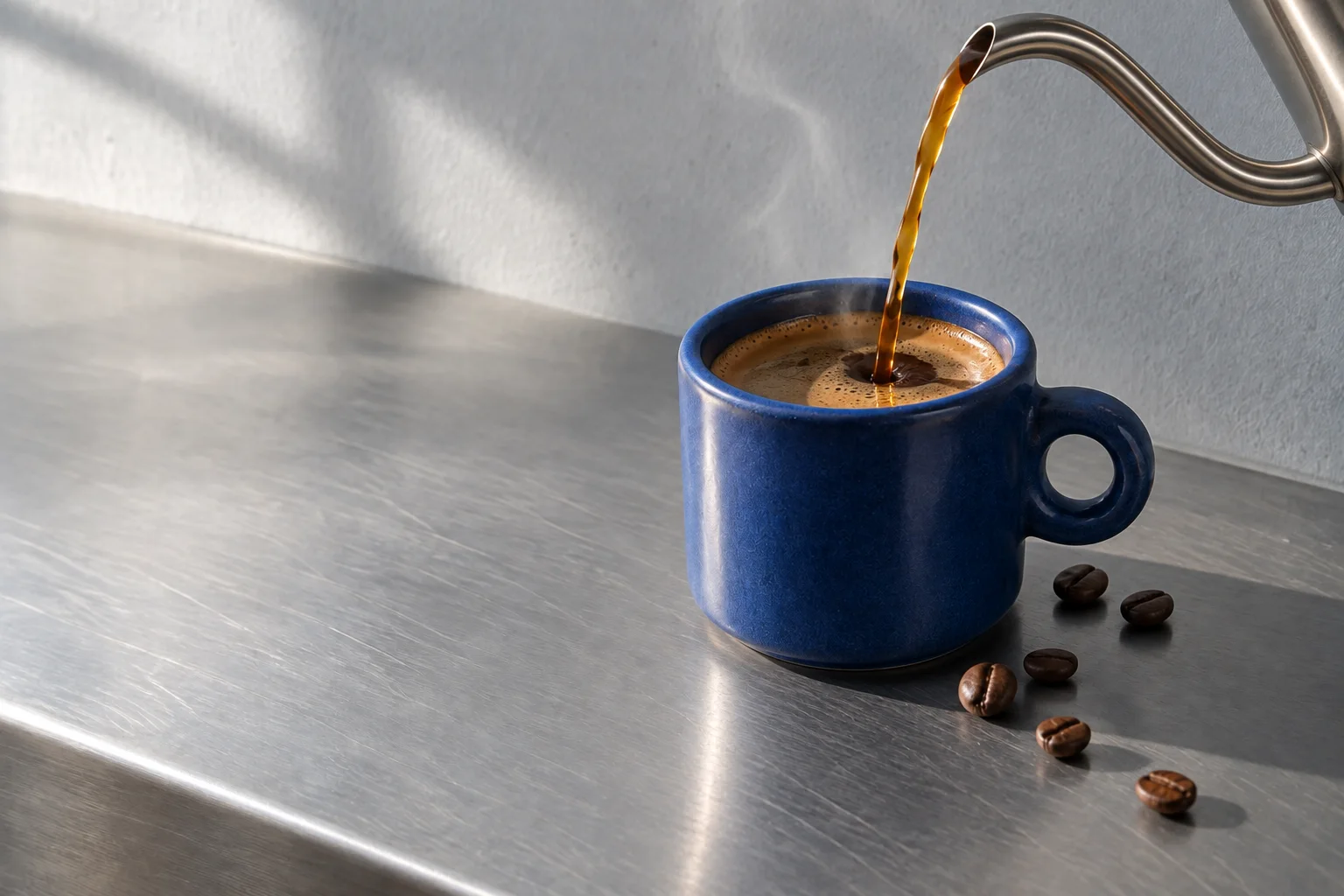
      <BeforeAfter label="Compare the flat profile with Halden colour" before={pourFlat} after={pour} beforeLabel="Flat" afterLabel="Halden colour" />
      <figcaption style={{ marginTop: 12, fontSize: 14, color: 'var(--bs-muted)' }}>Shot on the Halden R. Drag the handle to see the in-camera grade.</figcaption>
    </figure>
  );
}Installation
pnpm add @brand-studio/uinpm install @brand-studio/uiyarn add @brand-studio/uibun add @brand-studio/uiInstall the peer dependencies
npm install react react-domImport the stylesheet once
import '@brand-studio/ui/styles.css';Wrap your app in a brand theme
import { BrandTheme, BeforeAfter } from '@brand-studio/ui';
import brand from './brand.json';

<BrandTheme palette={brand.tokens} mode="system">
  {/* your app */}
</BrandTheme>
Usage
import { BeforeAfter } from '@brand-studio/ui';<BeforeAfter label="Compare the flat profile with Halden colour" before={flat} after={graded} beforeLabel="Flat" afterLabel="Halden colour" />Use two images of the same size and framing. initial sets where the handle starts, from 0 to 100.
Accessibility
- The handle is a native range input: arrow keys, Page Up and Page Down, Home and End all move it, and screen readers announce the position.
- Both images keep their alt text.
- A sideways drag moves the handle on touch; vertical swipes still scroll the page.
API Reference
| Prop | Type | Default |
|---|---|---|
before | ImageAsset | – |
after | ImageAsset | – |
label? | string | 'Compare images' |
beforeLabel? | string | 'Before' |
afterLabel? | string | 'After' |
initial? | number | 50 |
className? | string | '' |