
import { BrandImage, CustomCursor } from '@brand-studio/ui';
import { cameraViews } from '@/demos/assets';

const stories = [
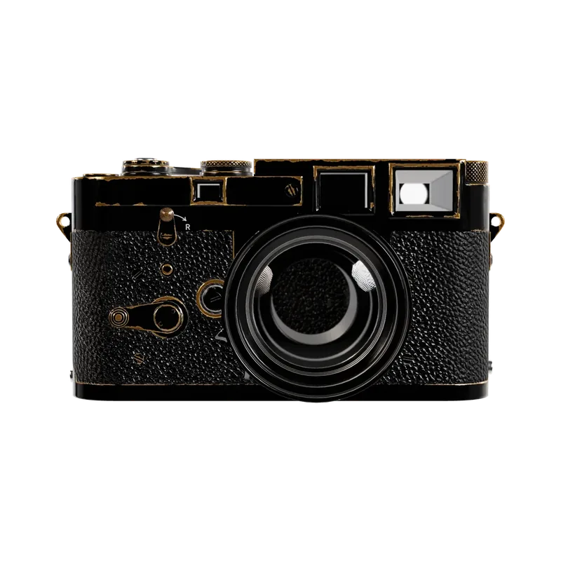
  { title: 'Built around one lens', image: cameraViews[1] },
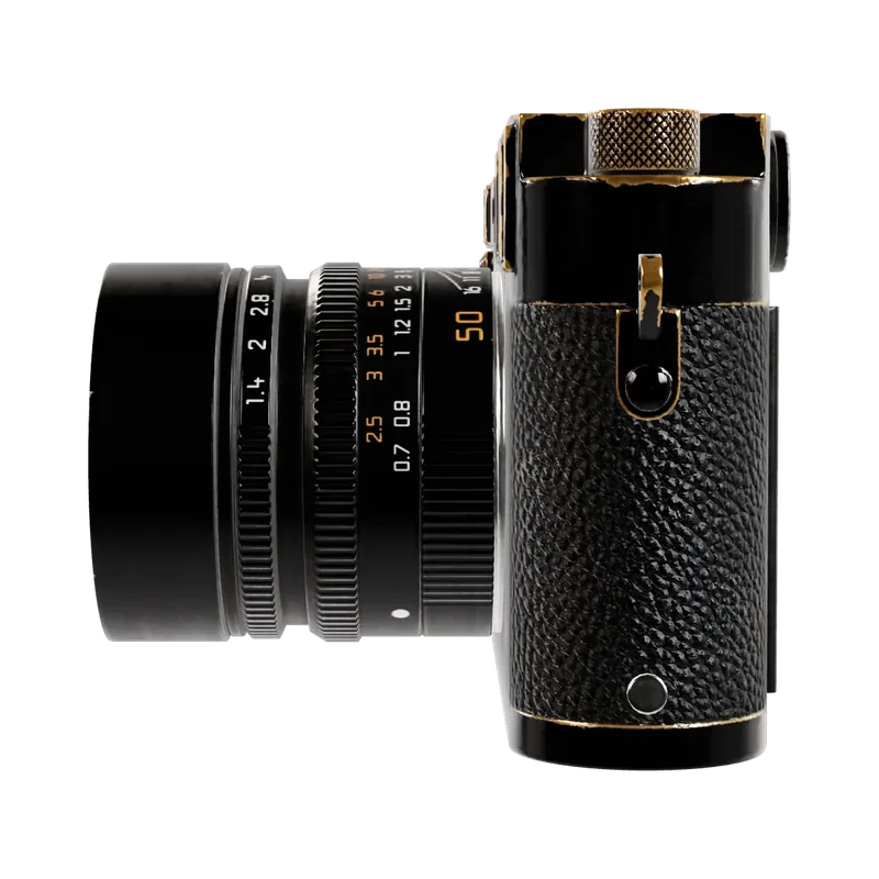
  { title: 'A grip cut from walnut', image: cameraViews[2] },
  { title: 'Three dials, no menus', image: cameraViews[4] },
];

export default function CustomCursorDemo() {
  return (
    <CustomCursor style={{ width: '100%', maxWidth: 720, padding: 8 }}>
      <ul style={{ display: 'grid', gridTemplateColumns: 'repeat(auto-fit, minmax(180px, 1fr))', gap: 16, margin: 0, padding: 0, listStyle: 'none' }}>
        {stories.map(story => (
          <li key={story.title}>
            <a href="#" data-cursor="Read" style={{ display: 'block', textDecoration: 'none' }}>
              <BrandImage asset={story.image} sizes="240px" className="demo-cursor-image" />
              <span style={{ display: 'block', marginTop: 10, fontWeight: 600 }}>{story.title}</span>
            </a>
          </li>
        ))}
      </ul>
      <style>{'.demo-cursor-image { aspect-ratio: 1; border-radius: 12px; }'}</style>
    </CustomCursor>
  );
}Installation
pnpm add @brand-studio/uinpm install @brand-studio/uiyarn add @brand-studio/uibun add @brand-studio/uiInstall the peer dependencies
npm install react react-domImport the stylesheet once
import '@brand-studio/ui/styles.css';Wrap your app in a brand theme
import { BrandTheme, CustomCursor } from '@brand-studio/ui';
import brand from './brand.json';

<BrandTheme palette={brand.tokens} mode="system">
  {/* your app */}
</BrandTheme>
Usage
import { CustomCursor } from '@brand-studio/ui';<CustomCursor>
<a href="/journal/lens" data-cursor="Read">Built around one lens</a>
</CustomCursor>The dot appears only inside the wrapper. It grows over any link or button; add data-cursor="Word" to an element to show a word in the ring.
Accessibility
- The system cursor stays visible; the dot is a decoration hidden from screen readers.
- Touch screens and reduced motion get no dot.
API Reference
| Prop | Type | Default |
|---|
Also accepts every HTMLAttributes<HTMLDivElement> attribute.