A row of image strips; the one you hover, focus or tap opens wide and shows its text.
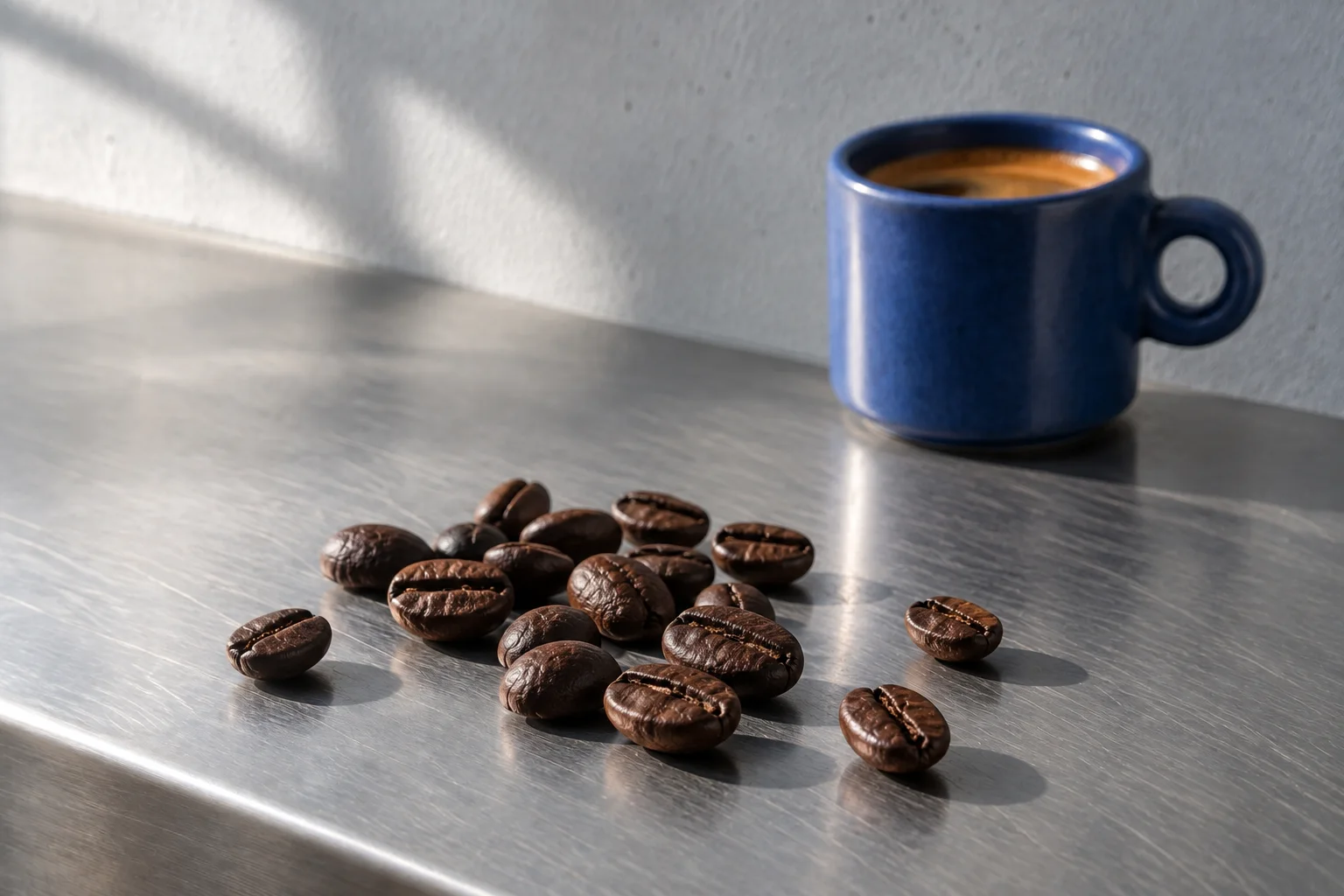
Washed lots from four farms, bought green and roasted every Monday.
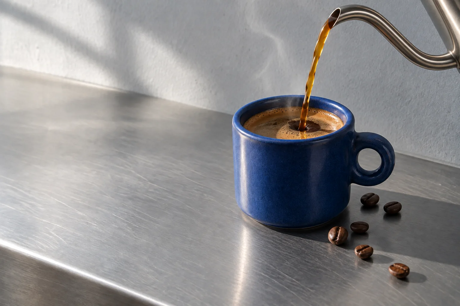
Ninety-four degrees, a thirty-second bloom and a slow spiral.
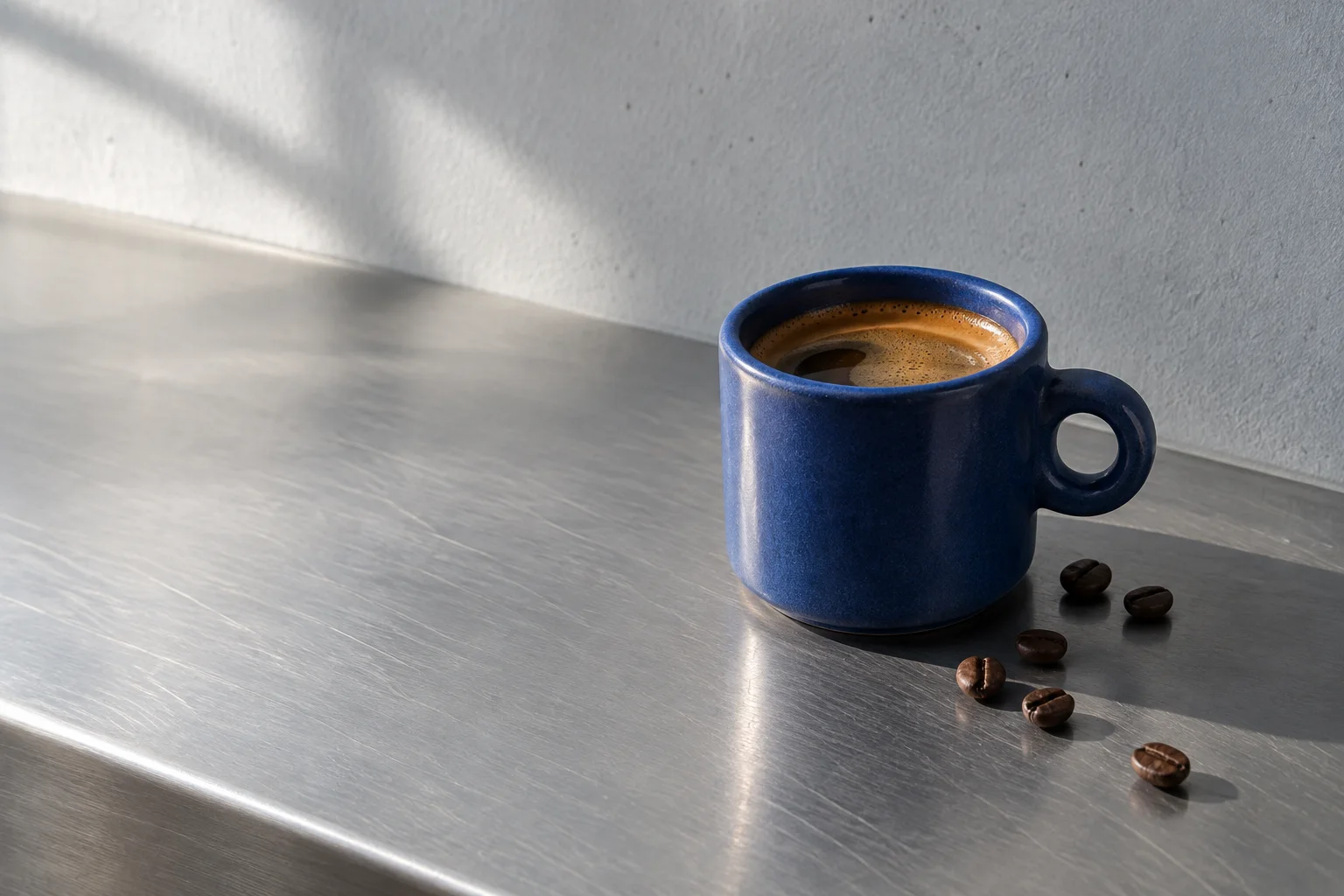
Stone fruit, brown sugar and a long, clean finish.
import { ExpandingPanels } from '@brand-studio/ui';
import { beans, cup, pour } from '@/demos/assets';

export default function ExpandingPanelsDemo() {
  return (
    <div style={{ width: '100%', maxWidth: 880 }}>
      <ExpandingPanels label="How we make a cup" panels={[
        { id: 'bean', title: 'The bean', asset: beans, body: <p>Washed lots from four farms, bought green and roasted every Monday.</p> },
        { id: 'pour', title: 'The pour', asset: pour, body: <p>Ninety-four degrees, a thirty-second bloom and a slow spiral.</p> },
        { id: 'cup', title: 'The cup', asset: cup, body: <p>Stone fruit, brown sugar and a long, clean finish.</p> },
      ]} />
    </div>
  );
}Installation
pnpm add @brand-studio/uinpm install @brand-studio/uiyarn add @brand-studio/uibun add @brand-studio/uiInstall the peer dependencies
npm install react react-domImport the stylesheet once
import '@brand-studio/ui/styles.css';Wrap your app in a brand theme
import { BrandTheme, ExpandingPanels } from '@brand-studio/ui';
import brand from './brand.json';

<BrandTheme palette={brand.tokens} mode="system">
  {/* your app */}
</BrandTheme>
Usage
import { ExpandingPanels } from '@brand-studio/ui';<ExpandingPanels label="How we make a cup" panels={[
{ id: 'bean', title: 'The bean', asset: beans, body: <p>Roasted every Monday.</p> },
{ id: 'pour', title: 'The pour', asset: pour, body: <p>A thirty-second bloom.</p> },
]} />Three to five panels work best. On screens under 640px the strips stack and the open one grows taller.
Accessibility
- Each strip's title is a button that reports whether its panel is open, and controls the text it reveals.
- Keyboard focus opens a strip, so tabbing walks through them.
- A mouse opens strips on hover; touch opens them on tap.
API Reference
| Prop | Type | Default |
|---|---|---|
panels | Panel[] | – |
label? | string | 'Panels' |
className? | string | '' |